"Dawen + Rieth"
- Real Estate
- Corporate Design
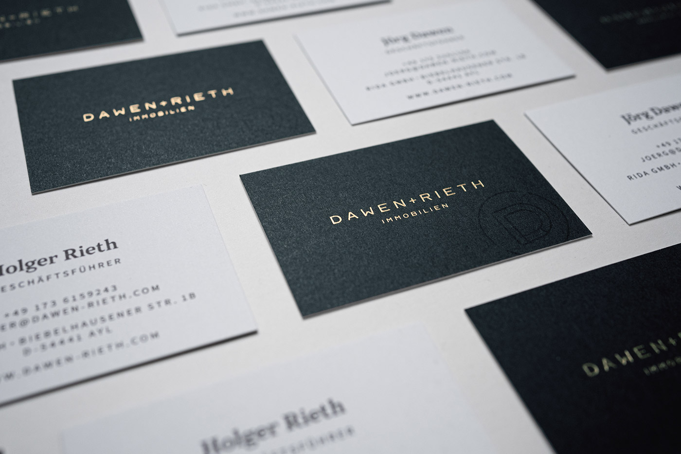
(01 - CD-ELEMENTE)
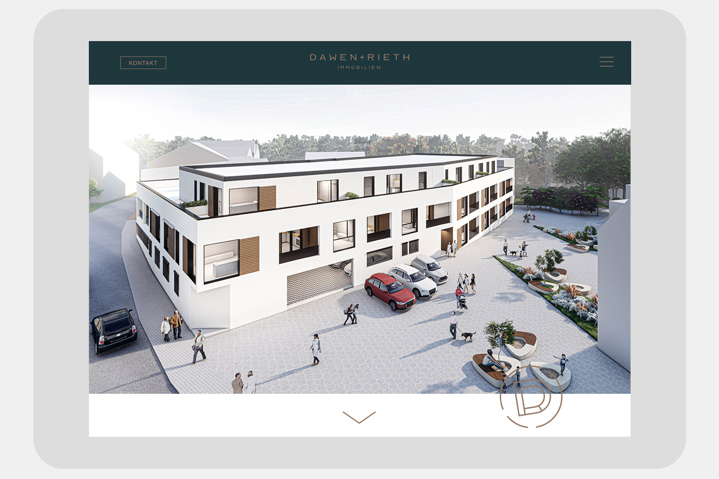
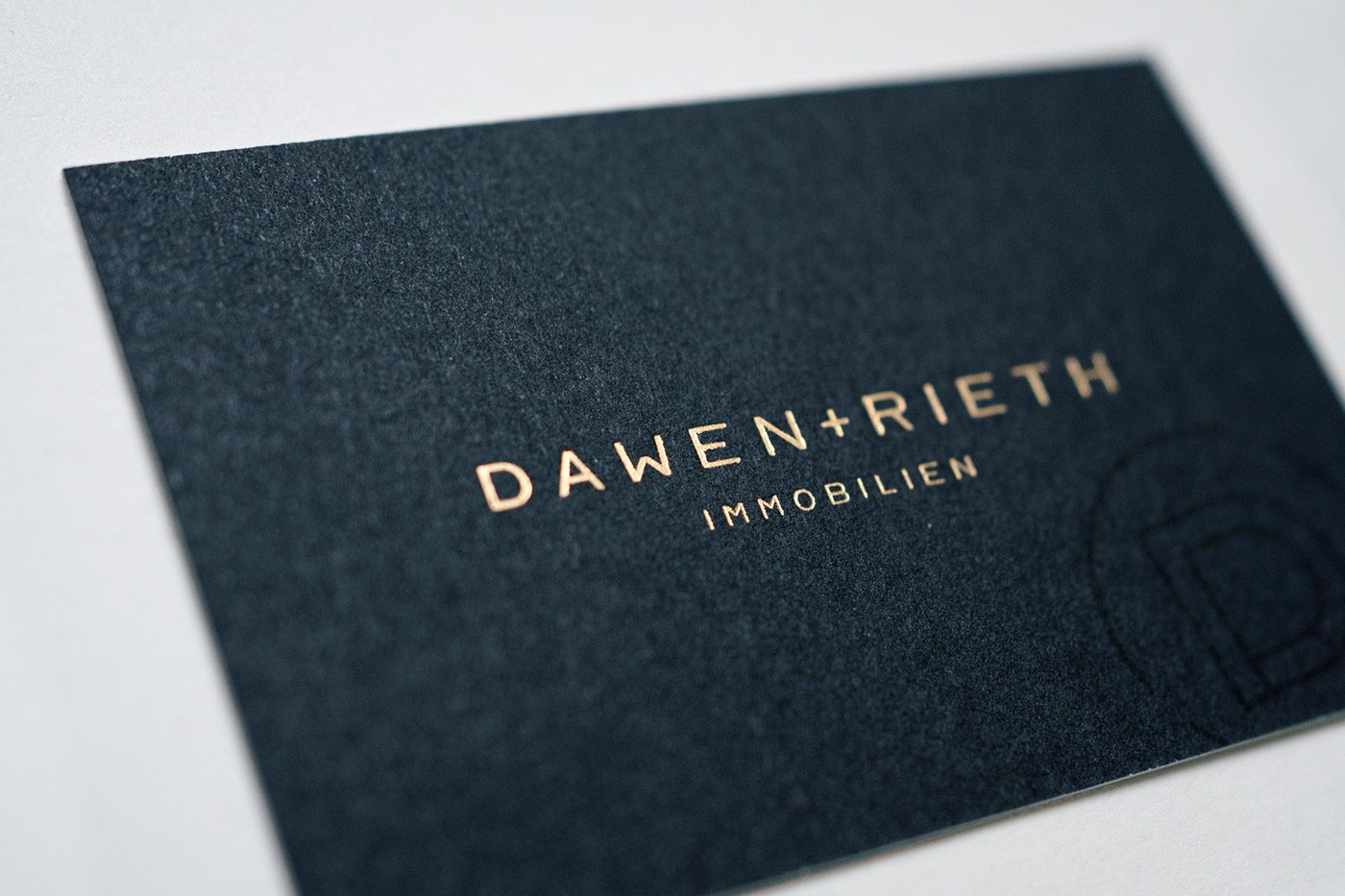
Dawen + Rieth creates living spaces - with high quality and a sense for sustainability. This is also how the brand is constructed: a noble look on a stable foundation made up of just a few branding elements.
- Corporate Design
- Editorial Design
- Campaign
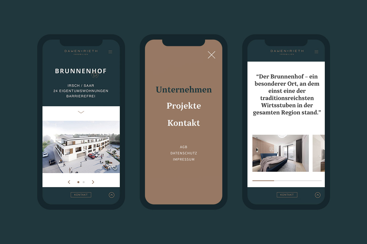
- Web Design
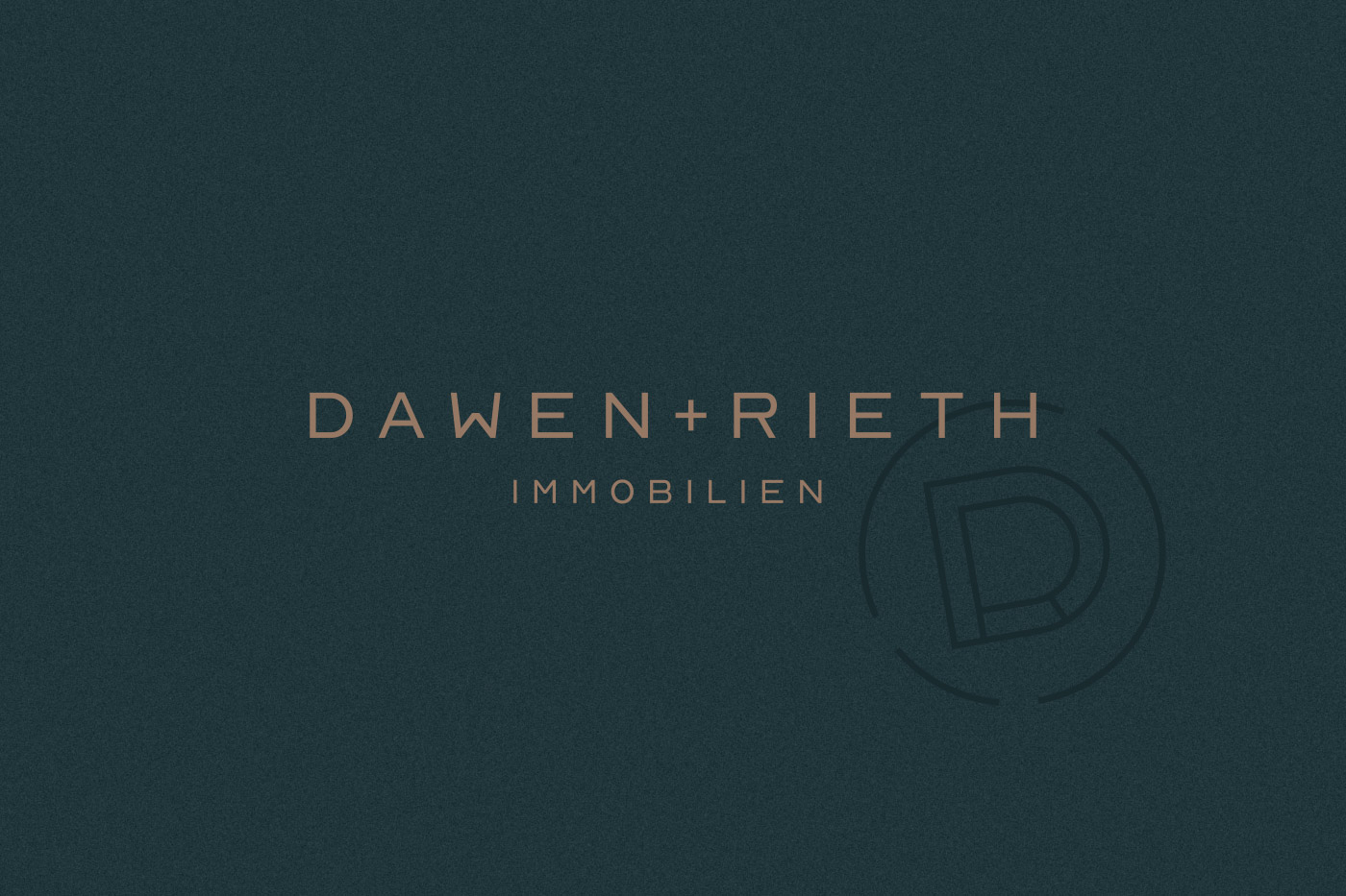
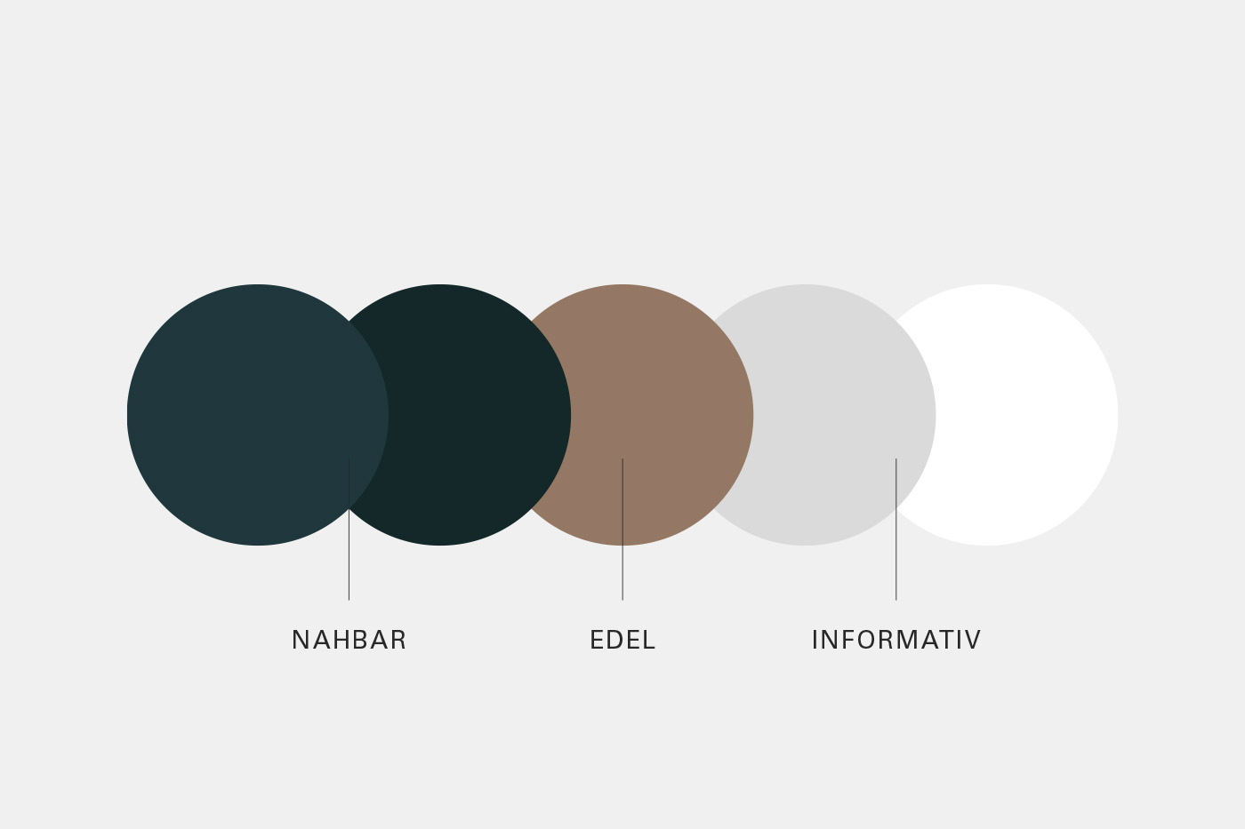
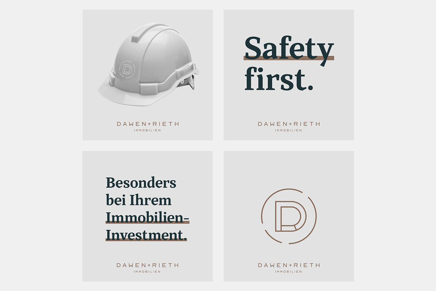
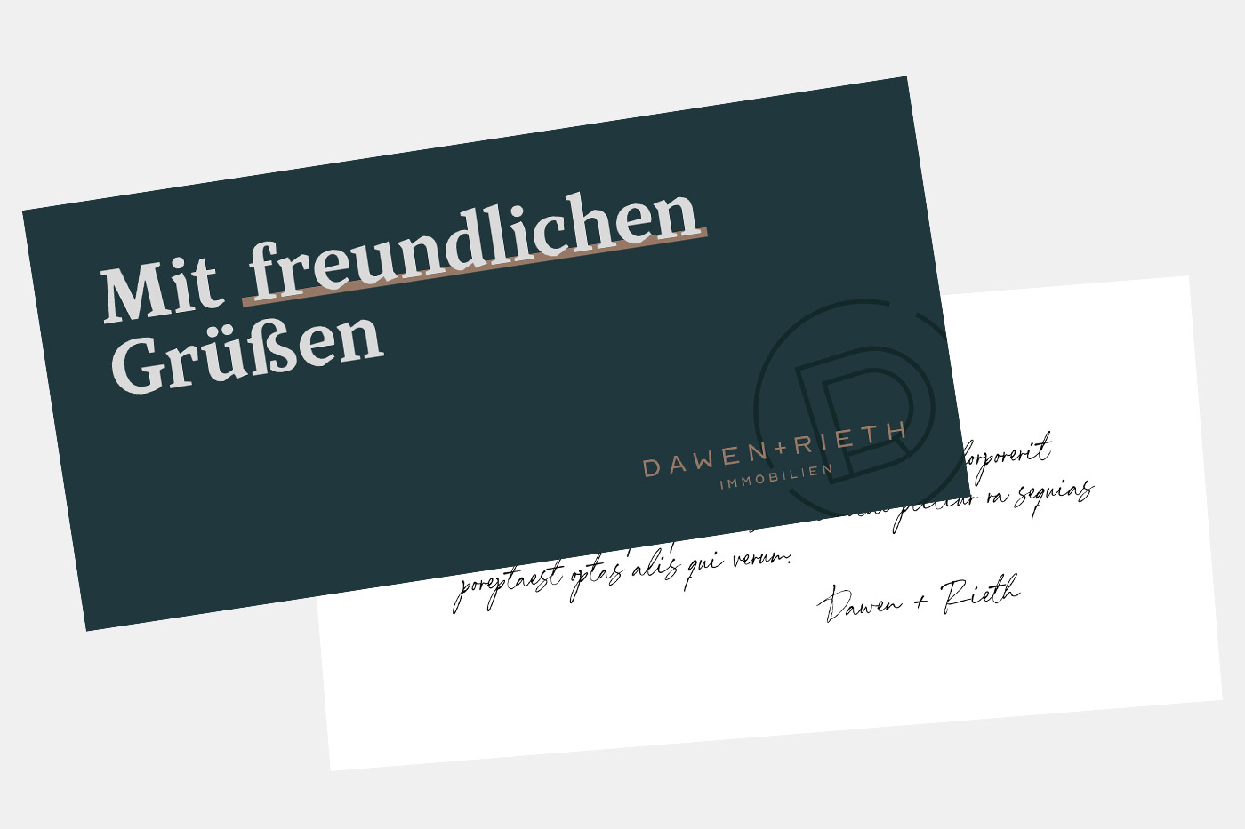
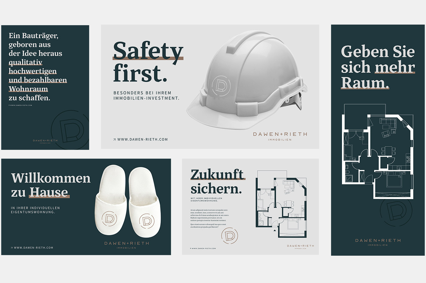
Sensitive but competent. Informative but approachable. Logo, colors, fonts and infographics that complement each other. Finally, the “DR” signet has its own stamp of quality.
(02 - Kommunikation)
How do you sell a product that doesn't exist yet? After all the branding creates the leap of faith.
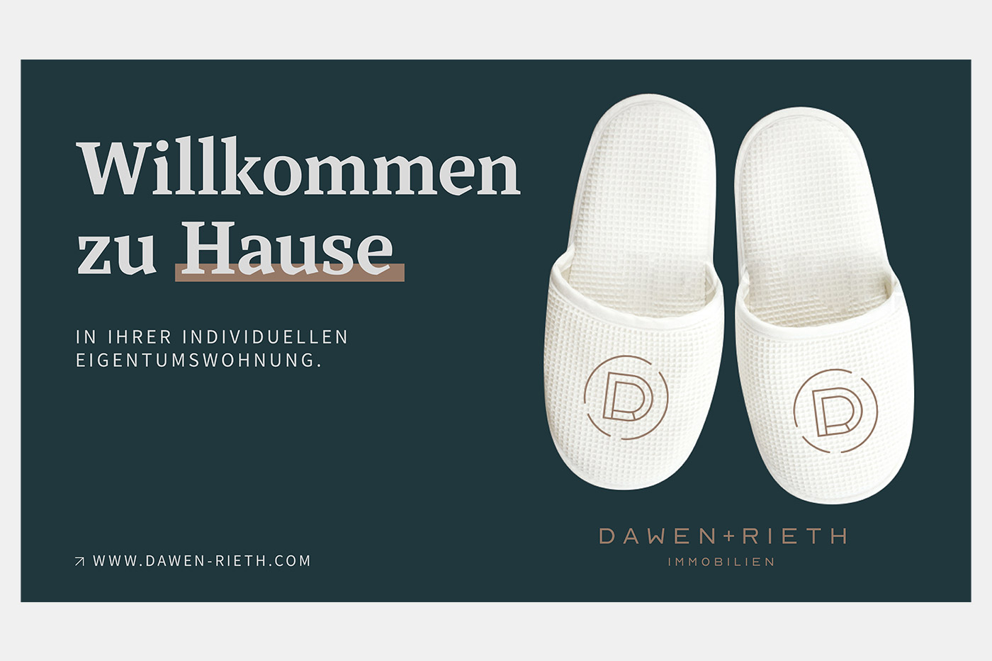

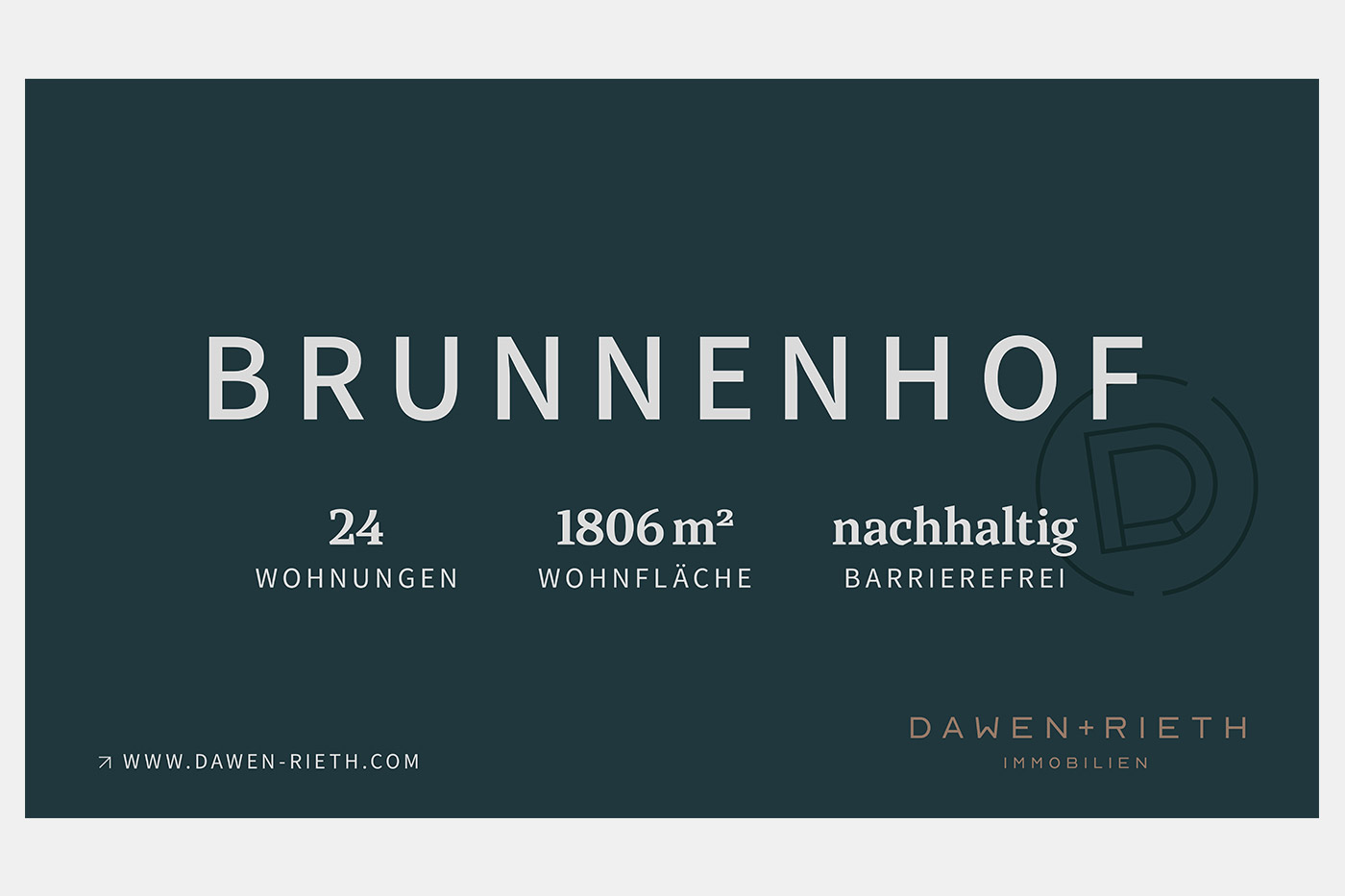
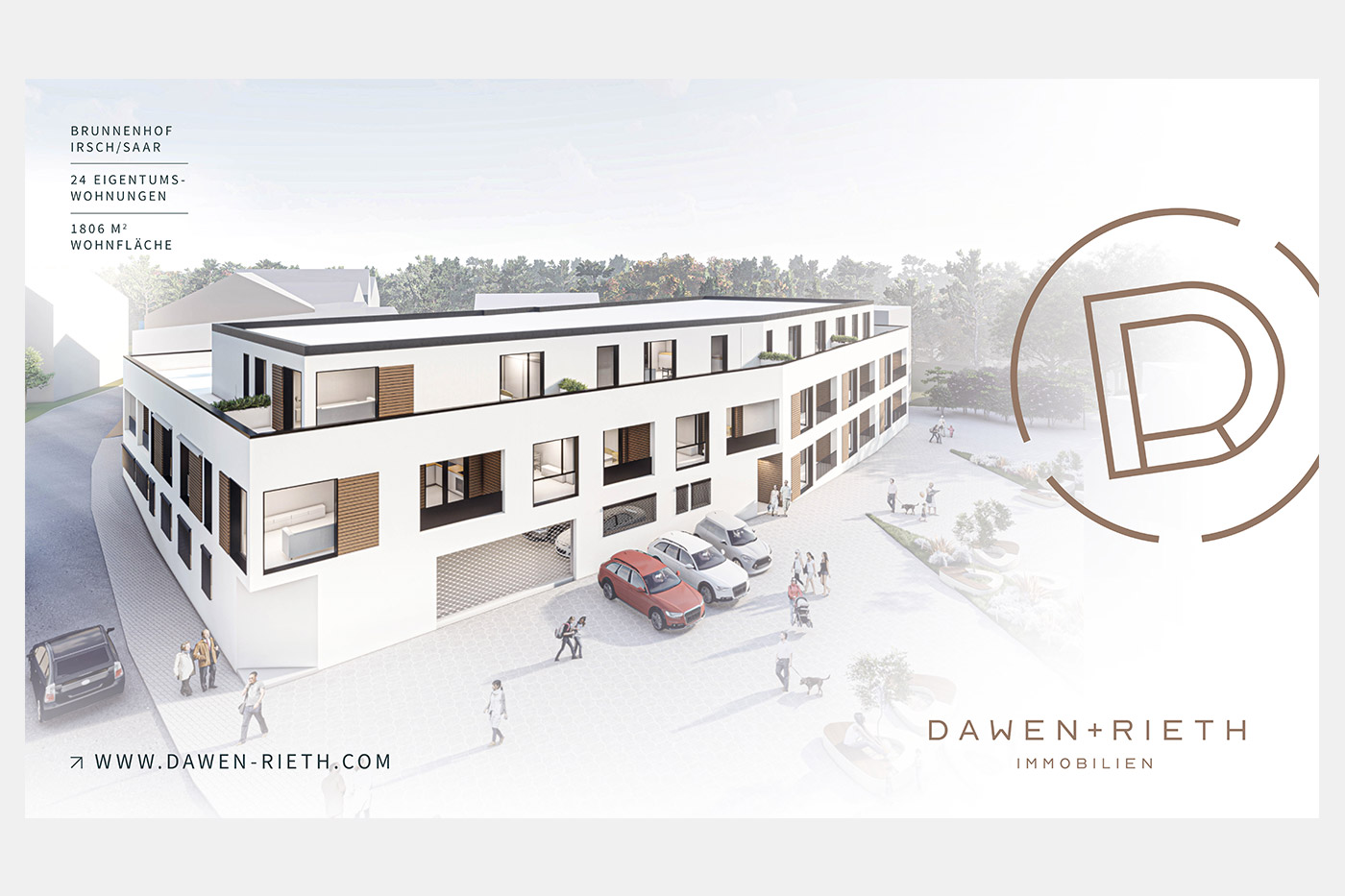
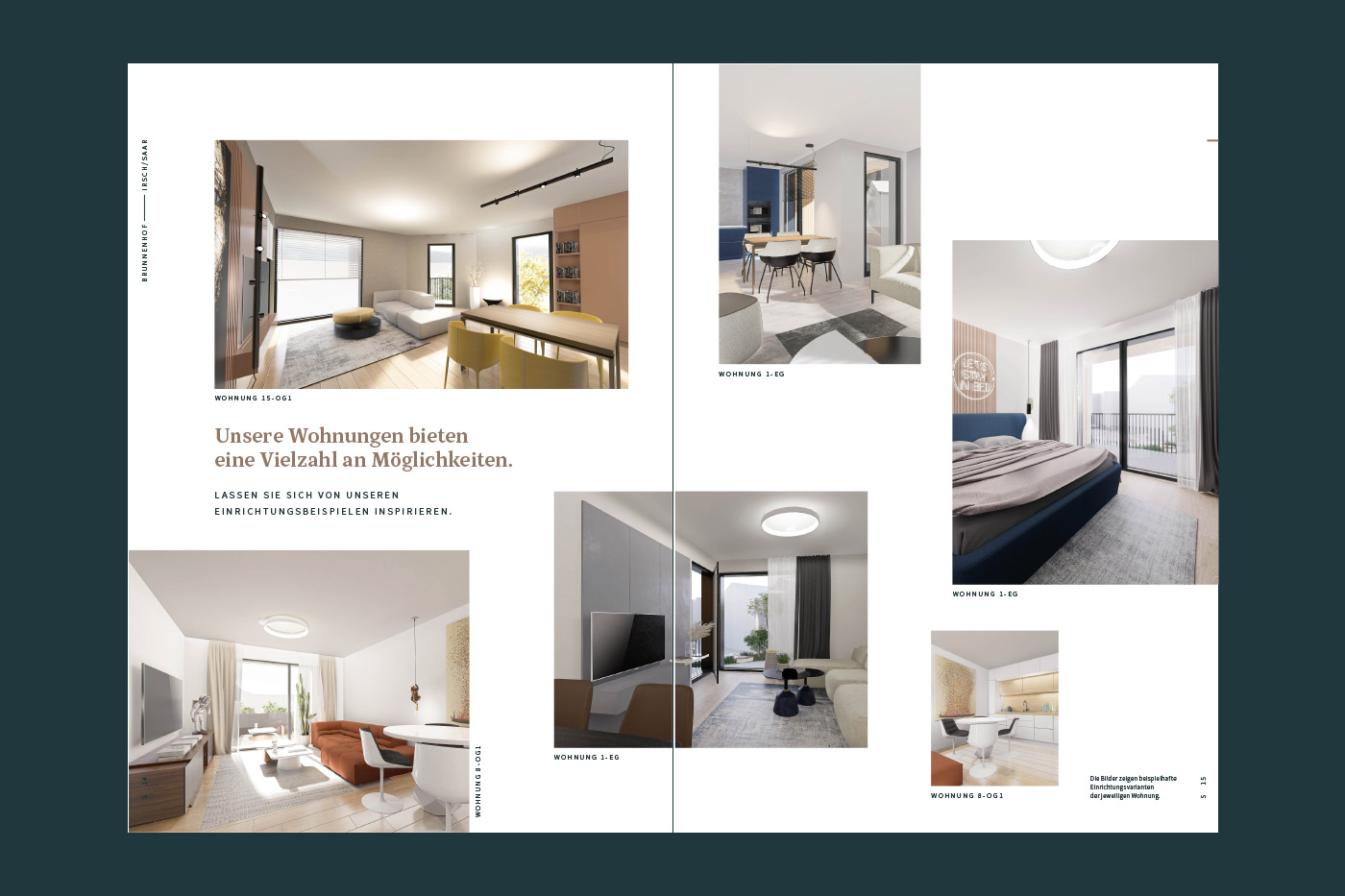
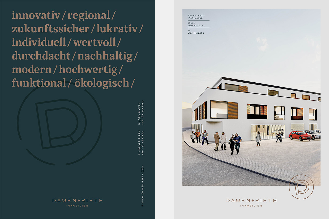
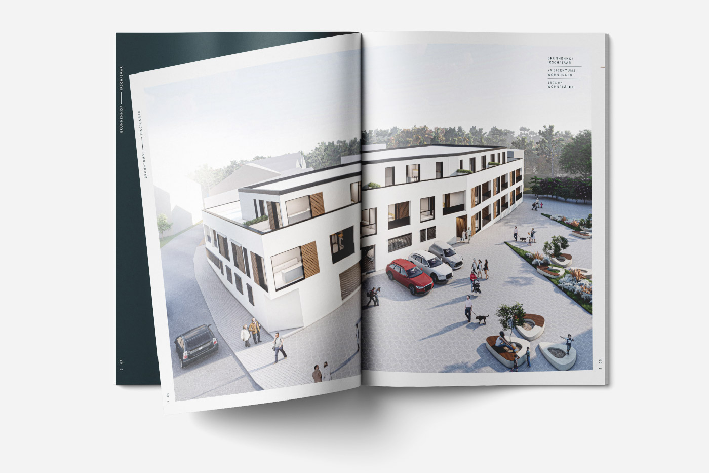
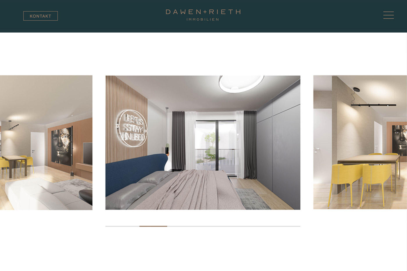
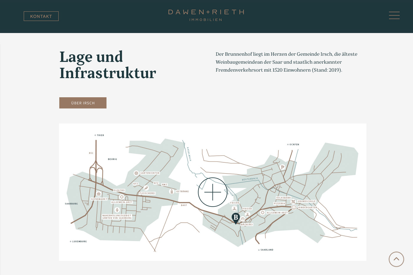
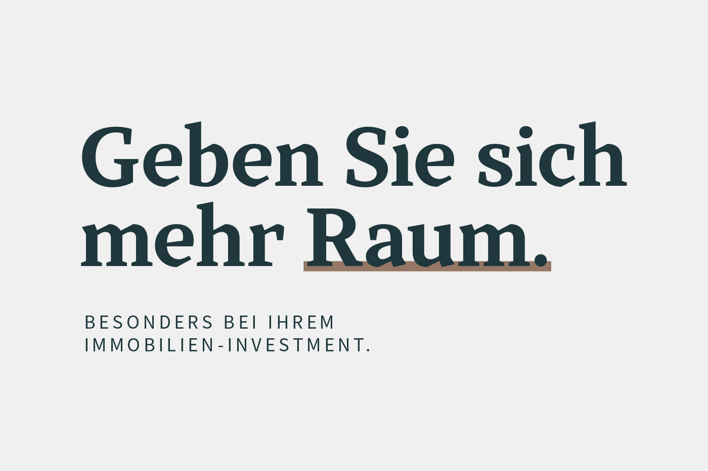
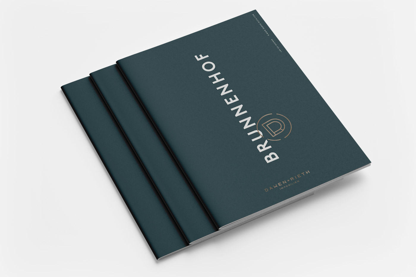
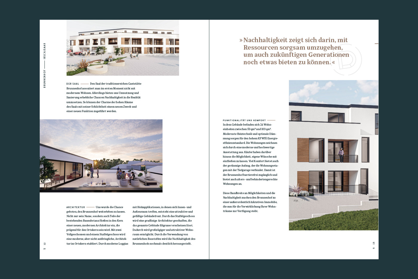
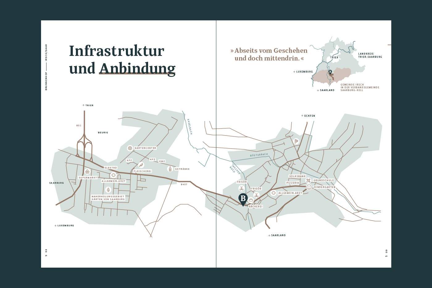
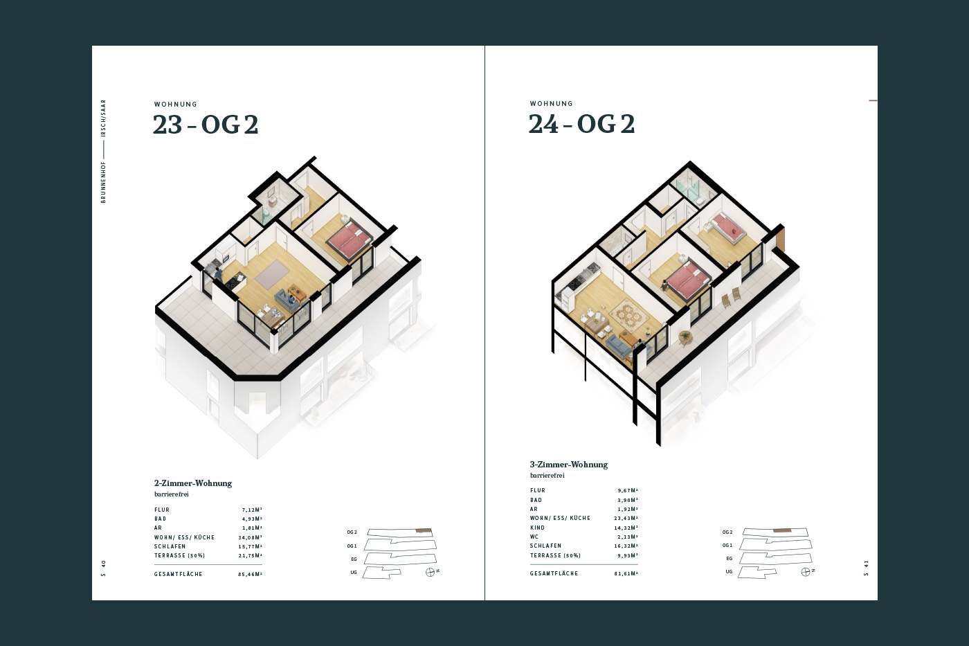
The brochure makes the vision tangible. Not only to make an impression, but above all to stimulate the imagination of the future home owner. On the second level, the hard facts are presented in an informative and understandable manner.
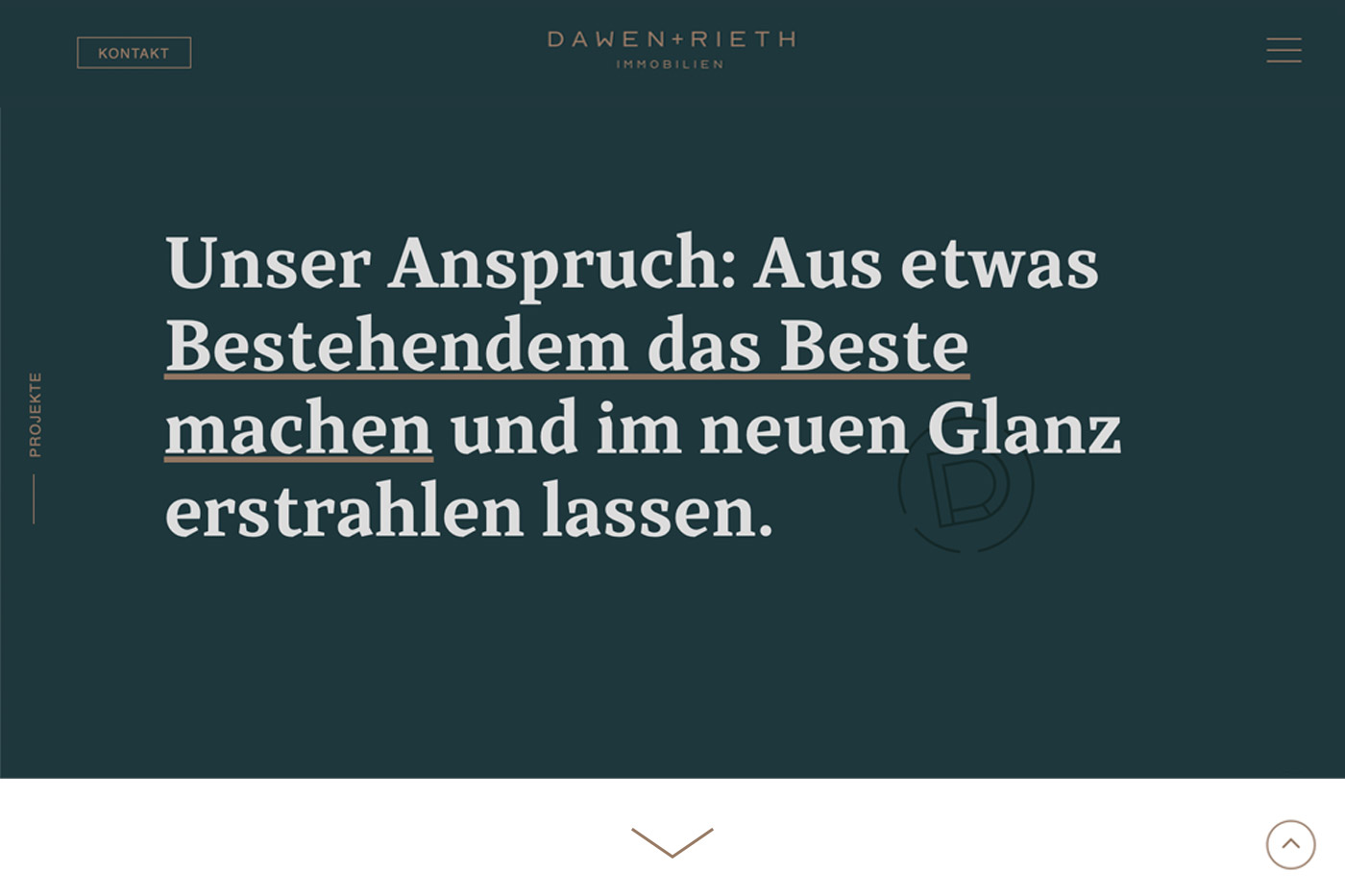
(03 - Website)