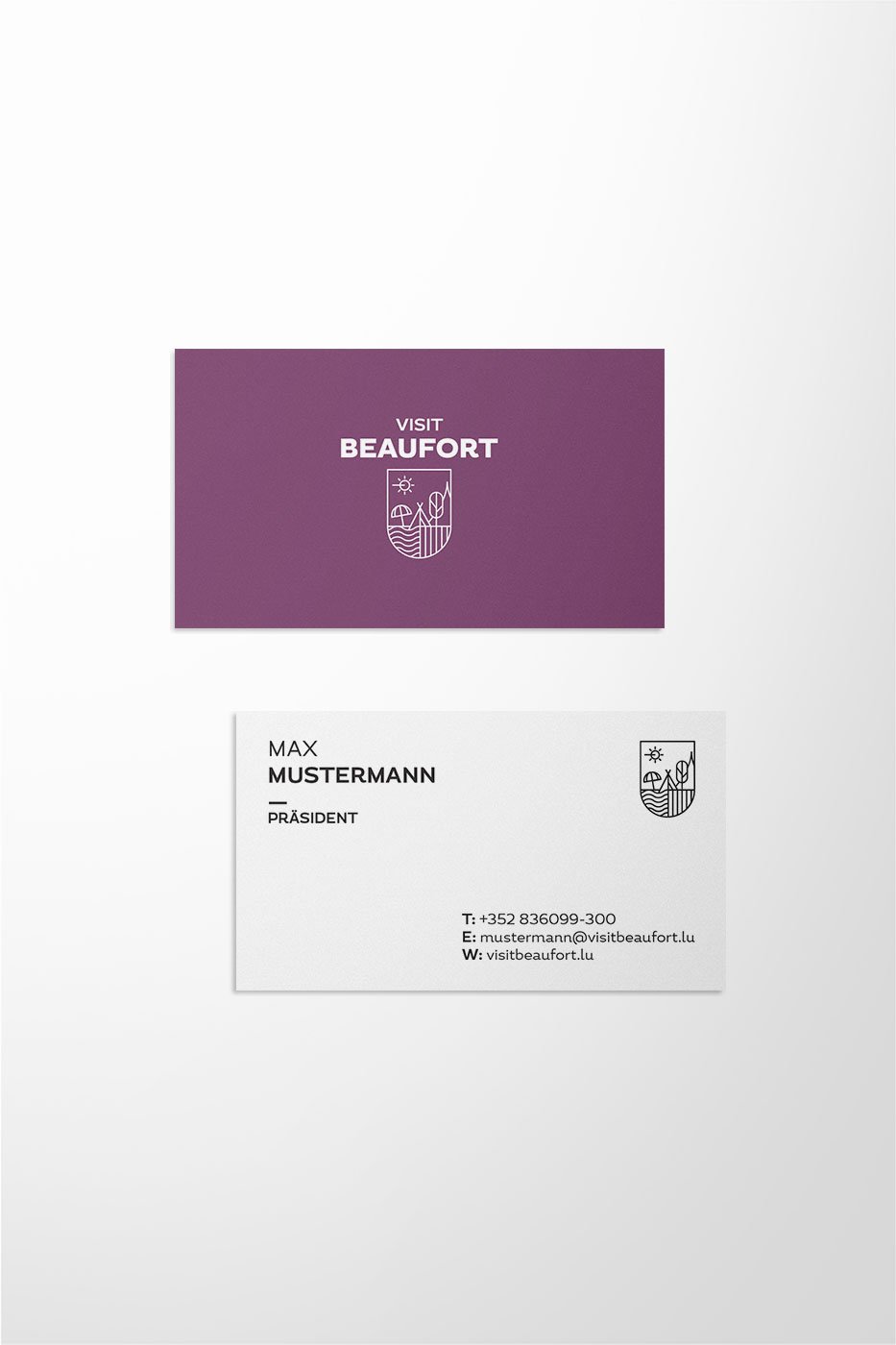
"Visit Beaufort"
- Tourism+Culture
- Corporate Design

(01 - LOGO)
Visit Beaufort is versatile. But the brand structure was just as complex because of its many sub-brands.
- CORPORATE DESIGN
- BRAND STRATEGY
- NAMING
- EDITORIAL DESIGN
- INFO GRAPHICS
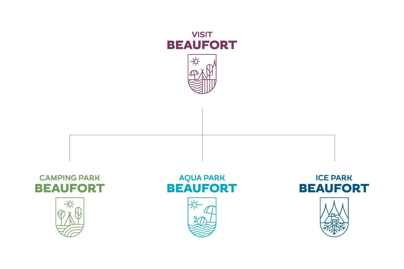
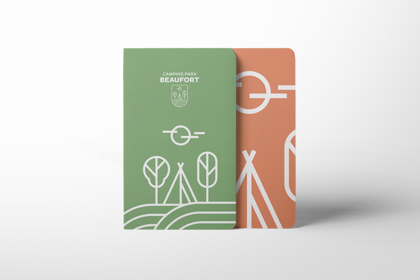
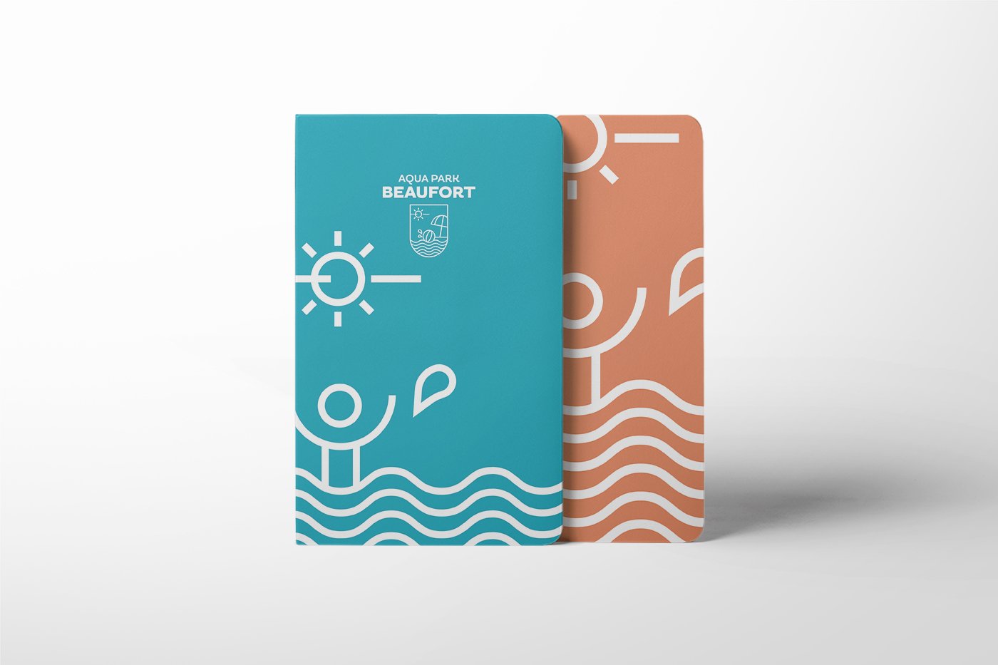
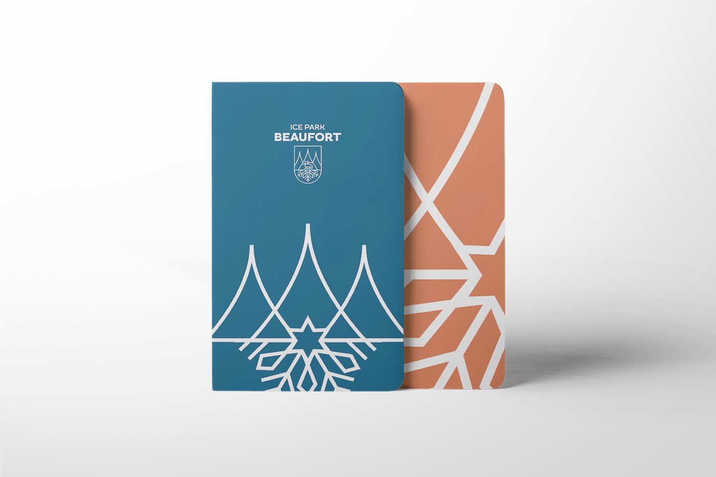
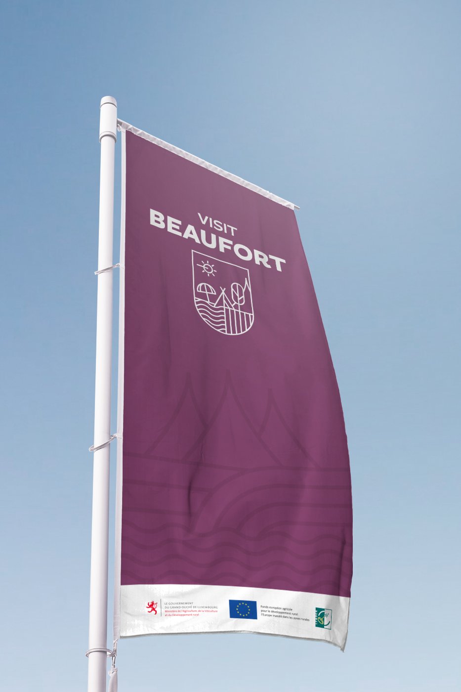
Many logos. Little togetherness. That was before the corporate design relaunch. Through a clear logo system, a brand hierarchy was created, which gives each sub-brand autonomy and yet is unmistakably assigned to the overall umbrella brand. The fact that the adapted naming goes hand in hand with the new brand concept is obvious.


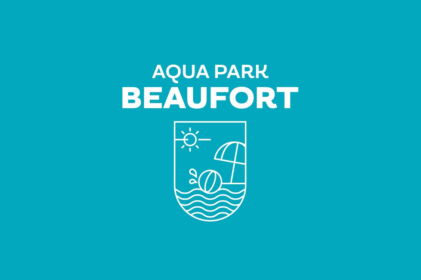
(02 - ICON SYSTEM)

(03 - COMMUNICATION)
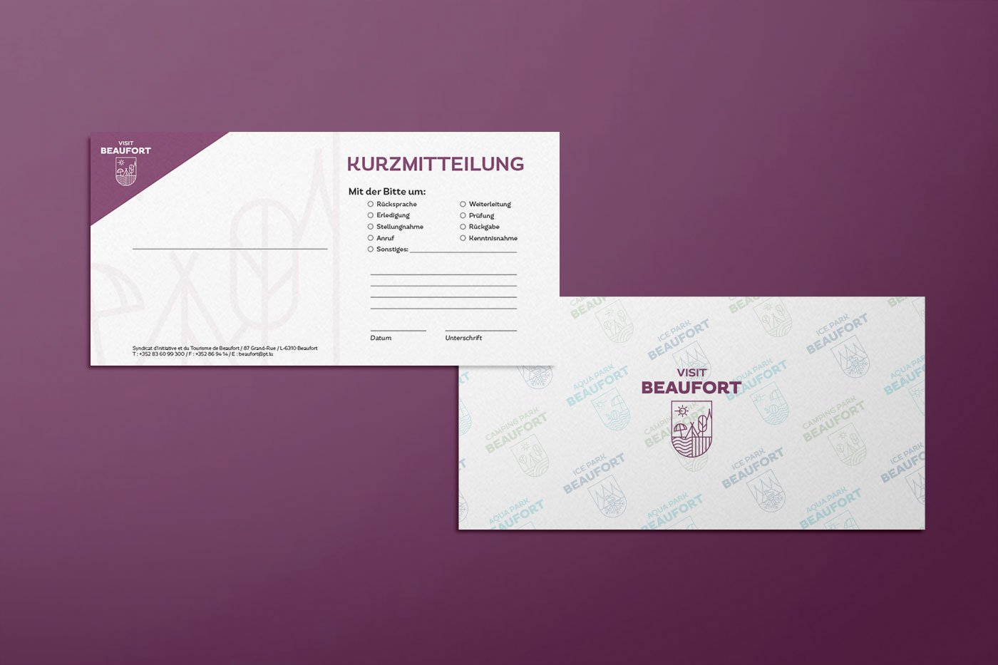
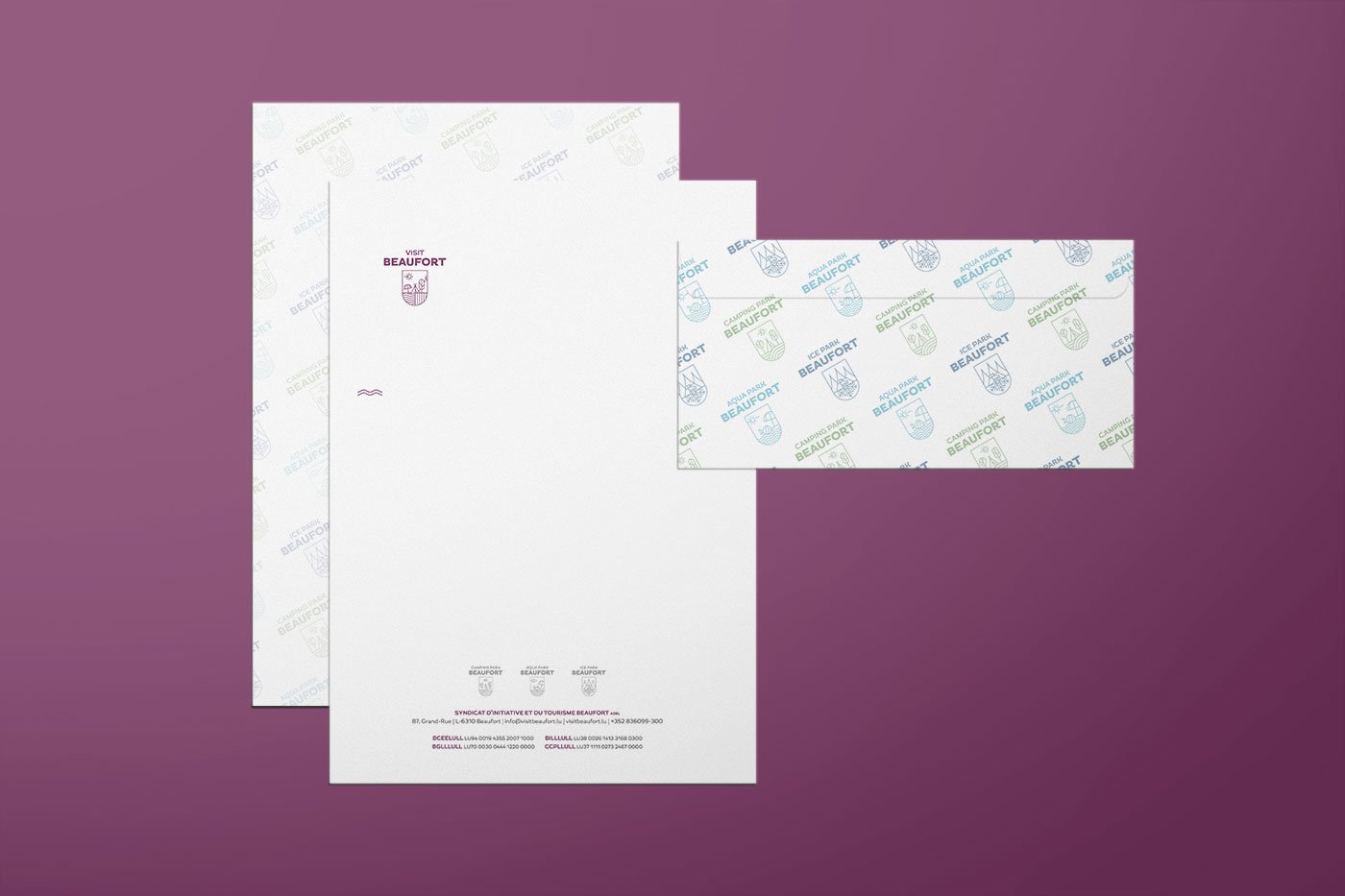
Visit Beaufort remains colorful and playful. But with clear guidelines in a defined, creative framework.
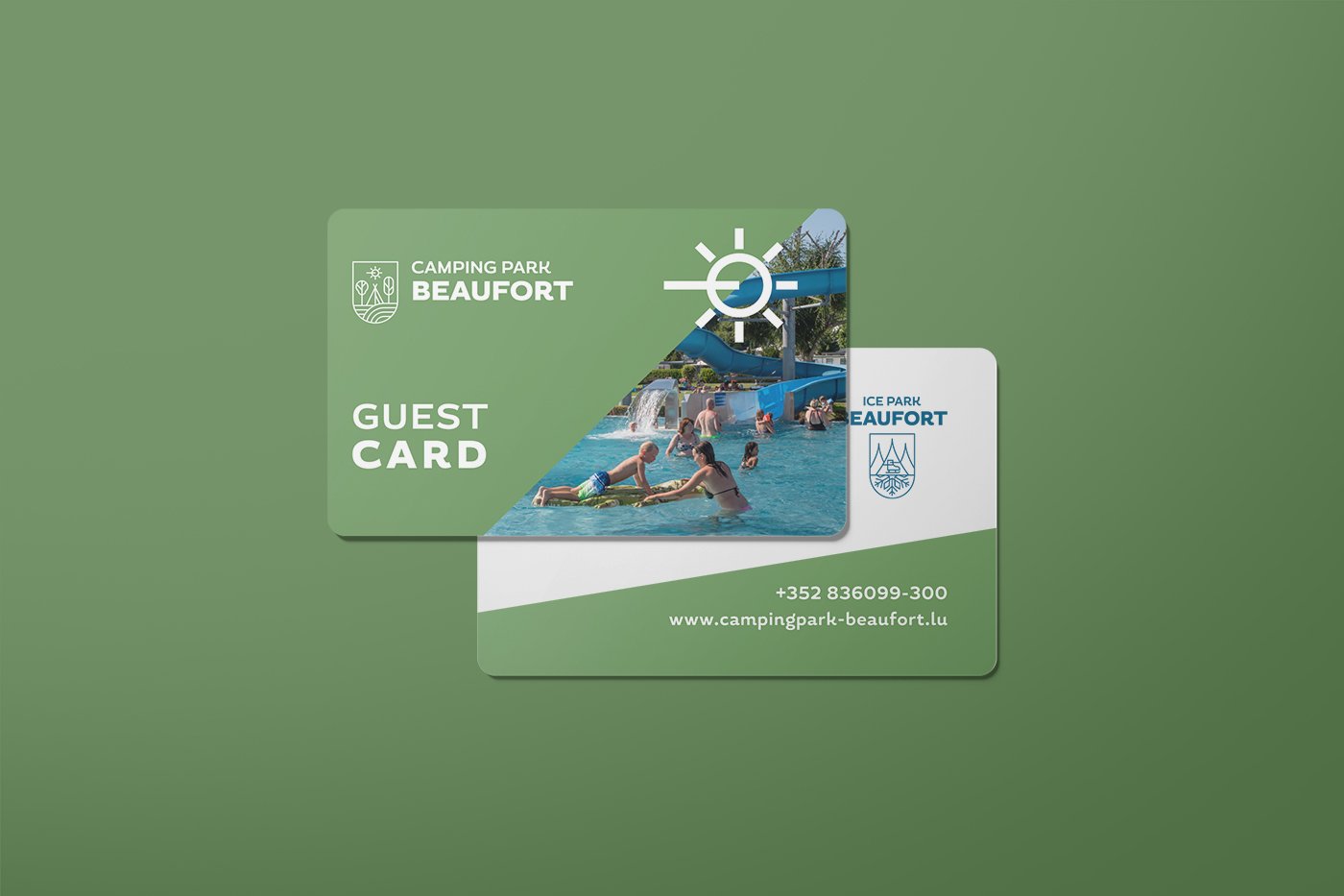
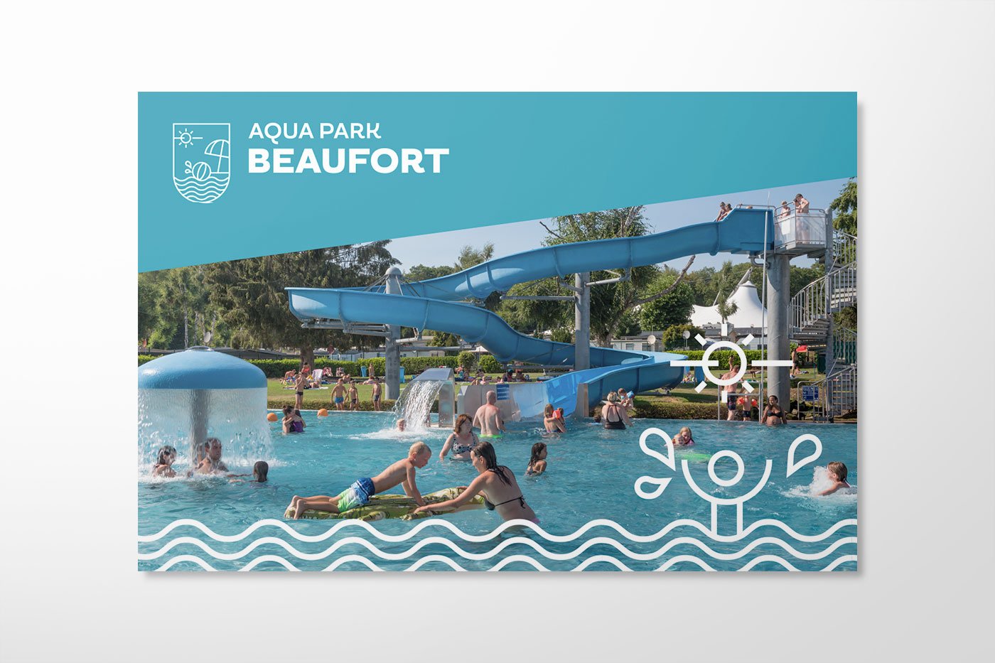
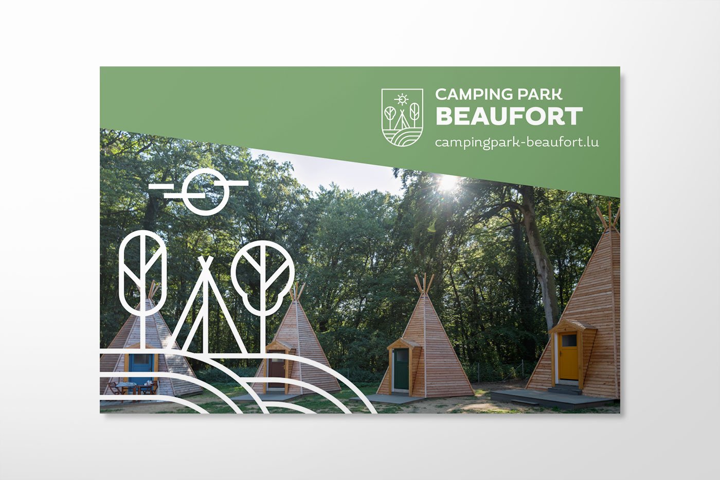

In the applications, the consistent continuation of the logo aesthetics is evident in the form of a complete icon set and minimalist illustrations. The few design elements promote the recognition value of the Visit Beaufort brand and yet allow enough variation to keep the branding dynamic.


(04 - STATIONARY)